


Court speed and hard-court homogeneity
Have hard courts become faster, and more similar, over time?

Following the announcement a few weeks back that Indian Wells had changed its court surface provider from Plexipave to Laykold, there was a renewed wave of chatter about whether hard courts are slowly becoming homogenised – that is, whether the variation in speed across hard courts is becoming smaller and smaller over time.
Evaluating whether hard courts really have become more homogeneous over time is no simple task.
Firstly, it’s hard to measure court speed in the first place. There are many factors which can impact court speed: humidity, wind, different ball types, different players and so on.
Secondly, the primary measure of court speed, ‘Court Pace Index’, has sparse and inconsistent data available to the public. Thankfully, there’s other metrics of court speed to draw on – devised by Jeff Sackmann from Tennis Abstract and Ultimate Tennis Statistics, respectively.
So, let’s first look into how these court speed metrics are calculated, before conducting some analysis to see how hard-court speeds have changed over and time, and if they really have become more homogeneous over time.
PART 1: The metrics
Court Pace Index
The primary method for measuring court speed is using a metric called Court Pace Index (CPI). CPI is calculated in real-time by Hawk-Eye. According to Laykold’s website, CPI factors in humidity and wind, ball striking and other environmental conditions.
The CPI value changes over the course of the tournament and is typically presented as an average. CPI tends to increase as a tournament progresses, as the grit on the court’s surface is worn away by the players.
As per this tweet from TennisTV from way back in 2016, CPI is measured as follows:

But what does this formula actually mean? Let’s break it down a little.
μ = Coefficient of friction. The coefficient of friction (COF) measures how much resistance to movement there is between a court surface and a tennis ball – that is, how much a ball’s speed decreases upon contact with the court surface.
Rougher surfaces like clay have a higher COF, which slows down the horizontal speed of a tennis ball more so than smoother surfaces like grass, which have a lower COF. Hard courts tend to have a slightly higher COF than grass.
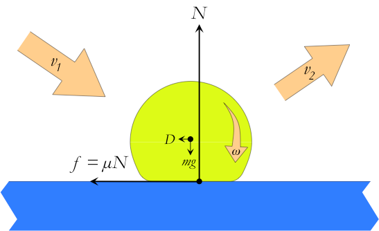
e = Coefficient of restitution. The coefficient of restitution, e, measures the ‘bounciness’ of a court surface. The COR measures how much vertical speed a tennis ball retains after bouncing on a court surface – in more technical terms, it measures the elasticity of a collision between a tennis ball and a court surface.1
A higher COR indicates a bouncier surface – that a ball will bounce back with more height after hitting the surface. Surfaces with a higher COR, like clay, play ‘slower’ because they allow more time for the receiver to react to the incoming shot.

0.81 = Average coefficient of restitution across all surface types.
According to the ITF’s technical booklet in 2025, the 0.81 used in the CPI formula refers to the mean coefficient of restitution across all surface types. But here’s the catch – the 0.81 was also being used in 2014. Does this mean that the average COR across all surface types has not changed in 10+ years? I’d say that’s highly unlikely.
The important distinction to make here is that the ITF technical booklets referred to are for Court Pace Rating, not Court Pace Index. CPR and CPI both measure court pace, but CPR is not measured dynamically, while CPI is. Therefore, considering that TennisTV hasn’t come back with an updated CPI formula since 2016(!), we can hopefully assume that the mean COR across the surface types is adjusted by Hawk-Eye over time.
There’s also no information on how ‘all surface types’ is defined – we don’t know which, or how many, surfaces are included in this calculation.
150 = Pace perception constant
There’s also a 150 in the formula – this refers to a “pace perception constant” - but again, there’s no information or explanation on how this number is derived.
This number amplifies the effect of the COR on CPI – that is, a lower value of COR will result in a greater increase in the CPI value. This is done to reflect that surfaces that bounce lower, such as grass, tend to play ‘faster’ than surfaces that bounce higher, like clay.
Court pace classifications
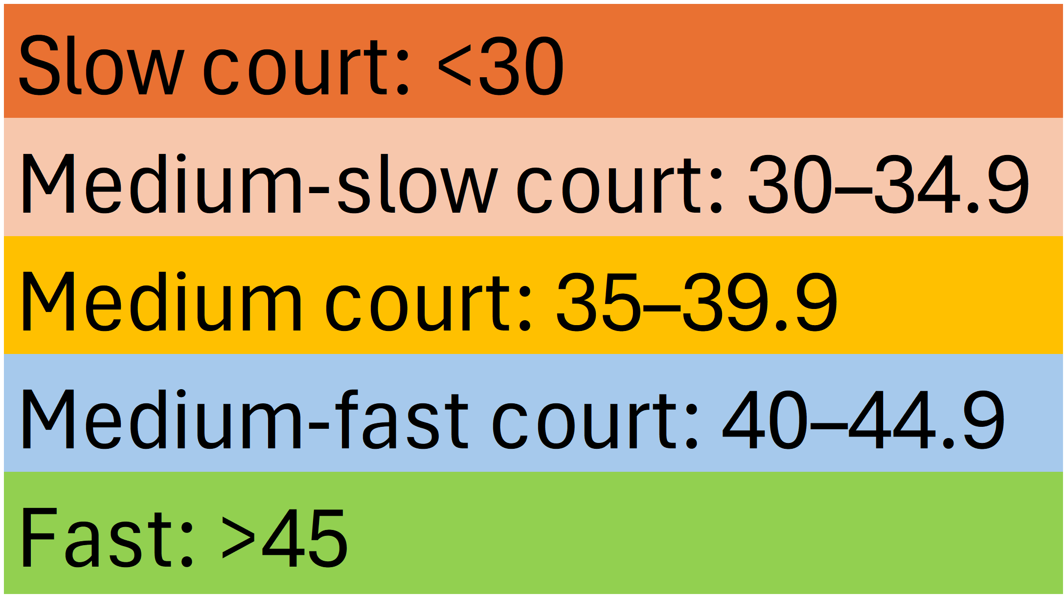
Once the COR and COF values have been obtained, this can be plugged into the CPI formula. Court pace is classified as follows:
Other court speed metrics
As I touched on briefly earlier - CPI data is quite sparse, meaning there’s a fair chunk of missing data over the years. In the absence of consistent CPI data, there are a couple of other court speed metrics that have been developed by members of the tennis community.
Tennis Abstract surface speed ratings
Jeff Sackmann from Tennis Abstract has devised a metric called ‘surface speed ratings’ to measure court speed. The metric uses the ace rate – adjusted for both the server and returners’ ability.2
The metric is indicated on a scale from 0 and above, with a surface speed rating of 1.0 denoting a tour-average surface speed. Tournaments with a value below 1 indicate a slower-than-average surface, those with a value exceeding 1 indicate a faster-than-average surface.
The usual range for tour events is between 0.5 (slow clay) and 1.5 (fast hard or grass).
Ultimate Tennis Statistics court speed ratings
Ultimate Tennis Statistics has also devised their own metric to measure court speed – one which also uses an ace rate that is adjusted for the server and returners’ ability, but with a slightly method of calculation to Tennis Abstract’s. The formula is as follows:
UTS’s court speed ratings are expressed in similar values to CPI – just on a larger scale – very slow surfaces tend to have a value of 20, with the fastest surfaces having a value of 100.
PART 2: The data
Having now looked at how the different metrics are calculated, the next step is to look at trends in hard court speeds over time, before then assessing whether hard courts have become more homogeneous over time.
For all analyses below, the data is limited to hard court tournaments at the Masters 1000 level and higher, and from 2017 onwards.3 This is because 2017 is the first year where each hard court tournament has a CPI observation.
CPI data – are ‘slower’ hard courts quickening up?
A quick note: the CPI data used in this article comes from a fantastic spreadsheet that
from has been maintaining over time. It’s a fantastic repository of data to have. Check out the spreadsheet here.I’ve created a table below, using CPI data only, that assigns a colour to the speed of the court for each hard court tournament:


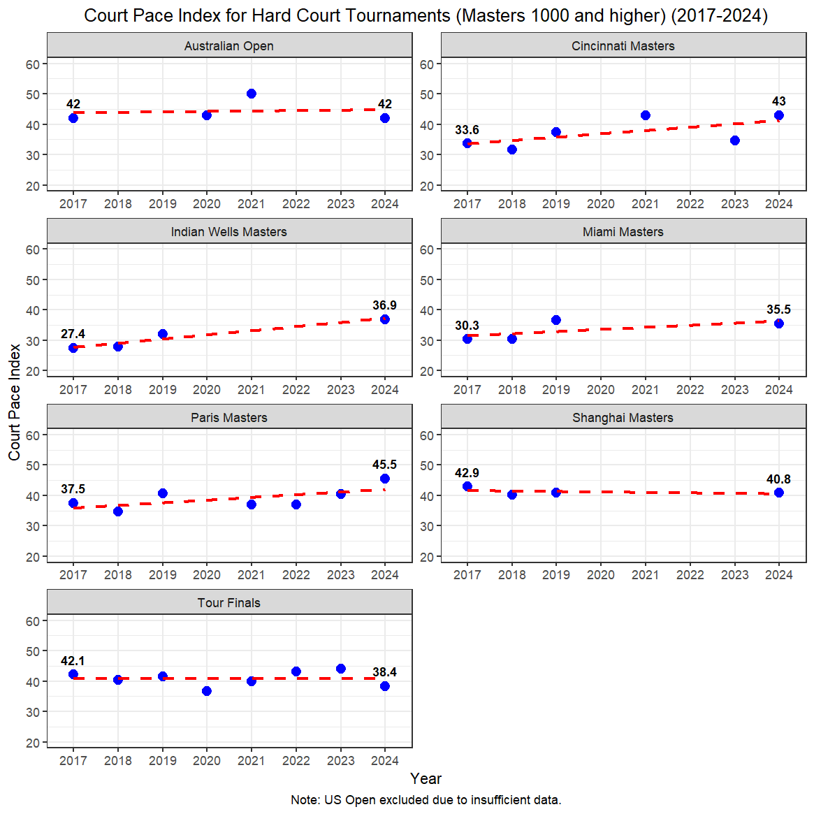
While we don’t have a complete picture over time due to missing data, a few things stand out.
Firstly, there’s been an increase in CPI across three of the typically slower hard courts – Indian Wells, Cincinnati and Miami. In 2017, these three tournaments were rated as ‘slow’ or ‘medium-slow’ hard courts, but in 2024, they were all rated as either ‘medium’ or ‘medium-fast’.
Additionally, there’s a lot of variation in CPI within tournaments year-to-year. Only Shanghai Masters maintained the same court speed classification (medium-fast) across each of its observations. All other hard courts had at least one change in its court speed classification from 2017 to 2024.
I’ve also fitted linear trend lines across each of the tournaments to illustrate the general trends in court speed over time – and it shows that, largely, CPI has increased across most major hard court tournaments – particularly for those that are typically considered ‘slower’:
Trends in (normalised) court speeds – contrasting views
While CPI is considered the more authoritative metric of court speed, I thought it would be interesting to compare the CPI data with the Tennis Abstract (TA) and Ultimate Tennis Statistics (UTS) metrics to see if court speed trends were similar.
To this end, I’ve normalised the data for each of the CPI, UTS and TA metrics so that all values are on a scale of 0-1, so they can all be compared to one another:

There are clear discrepancies in trends across each of the metrics, which most likely reflect the methodological differences between them all. CPI values are more bullish that hard court tournaments have either maintained or increased their court speed over time, while the TA and UTS metrics suggest that hard court speed has either slightly declined or remained the same.
This is most noticeable again among some of the ‘slower’ hard courts, such as Indian Wells and Cincinnati. TA and UTS speed metrics have court speeds trending slightly down for these two tournaments; CPI indicates that both Indian Wells and Cincinnati have gotten quicker over time.
This applies in reverse for the ATP Finals. TA and UTS data indicate a big increase in court speed since 2017, but CPI data suggests it has been stagnant.
The metrics are only largely in agreement for a couple of tournaments: Miami, and to a lesser extent, Paris Masters - with each metric indicating an upwards trend in court speed since 2017.
Has there been homogenisation in surfaces over time?
Knowing now that court speed is quite variable – both within tournaments and across metrics – it can be quite difficult to measure homogenisation in hard court surfaces over time with much precision or certainty.
But all the same, let’s investigate.
Box and whisker plots
One way to get a general sense about hard court homogeneity over time is through box and whisker plots.
The size of the boxes – also known as the interquartile range (IQR) – represent the middle 50% of court speed values. Boxes that are smaller in size indicate less variation across these middle 50% of court speed values, which therefore suggests a greater degree of homogeneity.
Here are the box and whisker plots for each of the metrics:

Across each of the metrics, the size of the IQR has generally decreased over time – pointing to increased homogeneity in hard court speeds, at least among the middle 50% of court values. This is more pronounced across the CPI and TA data, while the UTS data shows more fluctuation in the IQR over time.
However, there are a couple of caveats. Firstly, across the UTS and TA metrics, the ATP Finals often appears as an outlier across the boxplots and is therefore not being included in the IQR. Secondly, there’s still a lot of fluctuation in the IQR over time across all the metrics - that is, there’s no clear linear trend of a decline in IQR size - there’s still a lot of fluctuation from year to year.
So, on the whole, the variation in hard court speed among the middle 50% of values appears to be generally shrinking over time, but there is still a lot of fluctuation each year.
But, let’s now try to assess homogeneity including all court values, where possible.
Standard deviation
To ensure inclusion of all court speed values (including the ATP Finals), while assessing homogenisation, I’ve also looked at the standard deviation of court speeds over time, across each of the metrics.
Standard deviation measures how dispersed data is relative to the mean. In the context of court speeds, a lower standard deviation indicates that court speeds are similar and clustered around the mean, indicating greater homogenisation. A higher standard deviation indicates that court speeds are more spread out, and are less homogeneous.
Below is the standard deviation of the hard court speeds, across each of the metrics, over time:
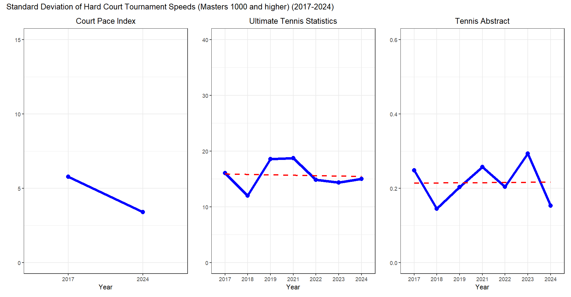
CPI values suggest an increase in hard court homogeneity – the standard deviation of the values were lower in 2024 compared to 2017. However, once again, this is only a point-in-time comparison due to missing data.
UTS data shows a notable drop-off in the standard deviation of hard court speeds in from 2021-2022 – indicating that hard courts may have become more homogeneous from 2022 onwards. Similarly, TA data shows a drop-off in standard deviation from 2023-2024.
However, looking across the whole time period, UTS and TA data suggests that hard court homogeneity has not changed drastically, despite these year-to-year fluctuations.
Overall thoughts and further reading
After all of this analysis, where does this leave us? Looking to the most authoritative metric of court speed, Court Pace Index, the data suggests that major hard courts have become faster, and that homogenisation has increased. However, most of the analysis was limited to point-in-time comparisons due to missing data.
In contrast, Tennis Abstract and Ultimate Tennis Statistics data suggest that hard court speeds have remained the same or decreased a little over time – and that homogenisation, while it has increased in recent years, is at fairly comparable levels to 2017.
Importantly, all of the data shows that there is significant variation in hard court speeds year-to-year – meaning that even if hard courts do appear to be a lot more homogeneous in a particular year, it doesn’t necessarily mean that they’ll always be that way.
For those of you who stuck around until the end, thanks very much for reading. I hope you found it of some use.
And finally, for those who wish to read more on court speeds, I would highly recommend Fogmount’s article, and a range of papers (like this one) by Rod Cross, a physicist at UNSW.
The coefficient of restitution is calculated by dividing the ball’s velocity after the bounce by the ball’s velocity before the bounce.
The adjustment for the server’s ability is done by calculating a player’s season average ace rates across clay and hard-court/grass, which are weighted by one-third to clay and two-thirds to hard/grass to be representative of a normal schedule.
Excluding 2020 data.